Apartment Picks Case Study
apartmentpicks.com-
Role
UX/UI Product Designer
Creative Director -
Team
Product Manager
Marketing
Developer -
Deliverables
High Fidelity Designs
Component Libraries
The Challenge
My mission was to create a website that is fast and easy to browse through apartment properties and capture the contact info of interested users. We needed it to be responsive, incorporate a working location map and have editorial content.
The Plan
Develop an intuitive and flexible mockup design file for easy development. Make the search process accessible, streamlined, and user-friendly for all users, regardless of their demographic.
Highlights
Discovery
I launched into a detailed research phase with a clear aim: to map out where we could best capture data. This process entailed a thorough examination of every feature, discerning what elements were needed. A crucial part of this journey involved collaboration; I sat down with the product manager to ensure our exploration was comprehensive and aligned with both user needs and business goals.
With direct feedback from our users, we identified what is needed for a easy way to look for apartments in a local area. Our focus sharpened on enhancing user experience by making the apartment shopping experience clear and easy.
This diligent analysis laid a solid foundation for the development of the mockup design file, aimed at providing users with unprecedented control and flexibility over their app's design. This initial research and discovery phase was pivotal, steering the project towards creating a more intuitive and user-friendly customization tool.
Observations
Creating a System
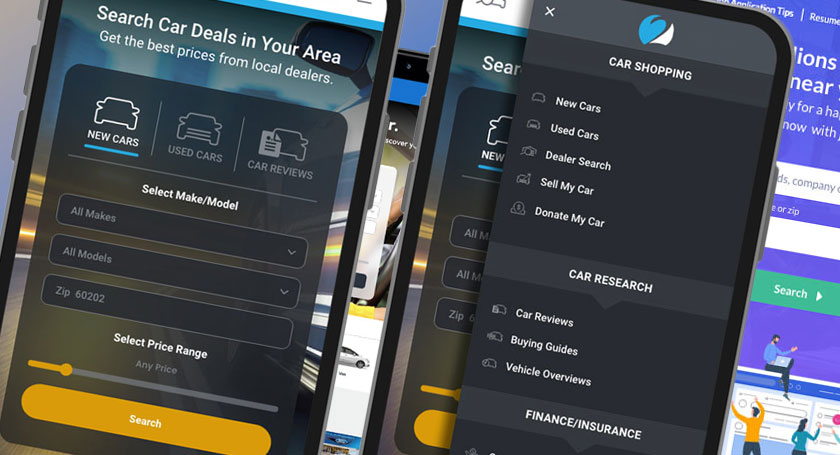
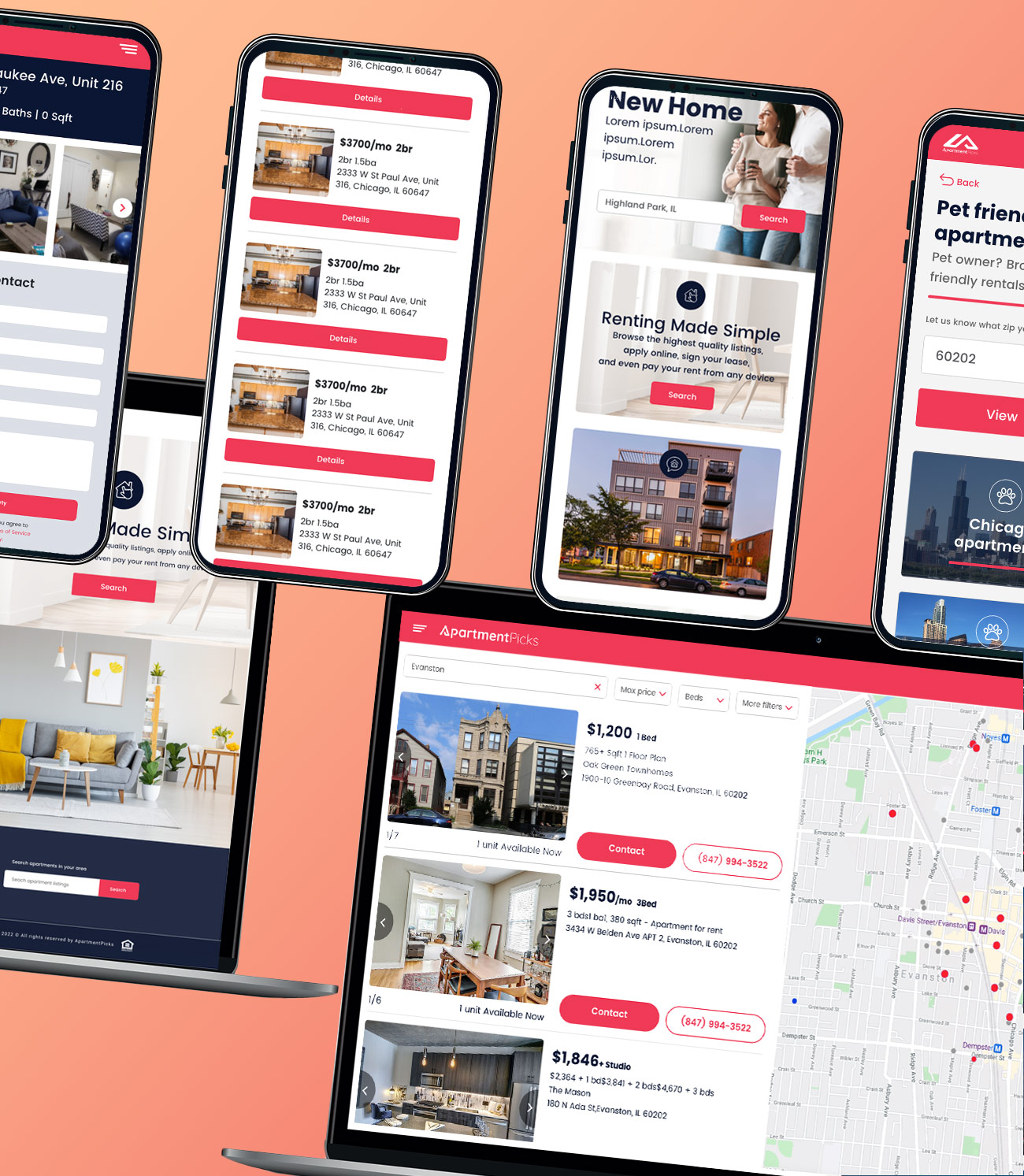
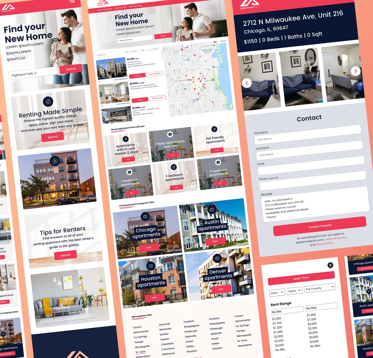
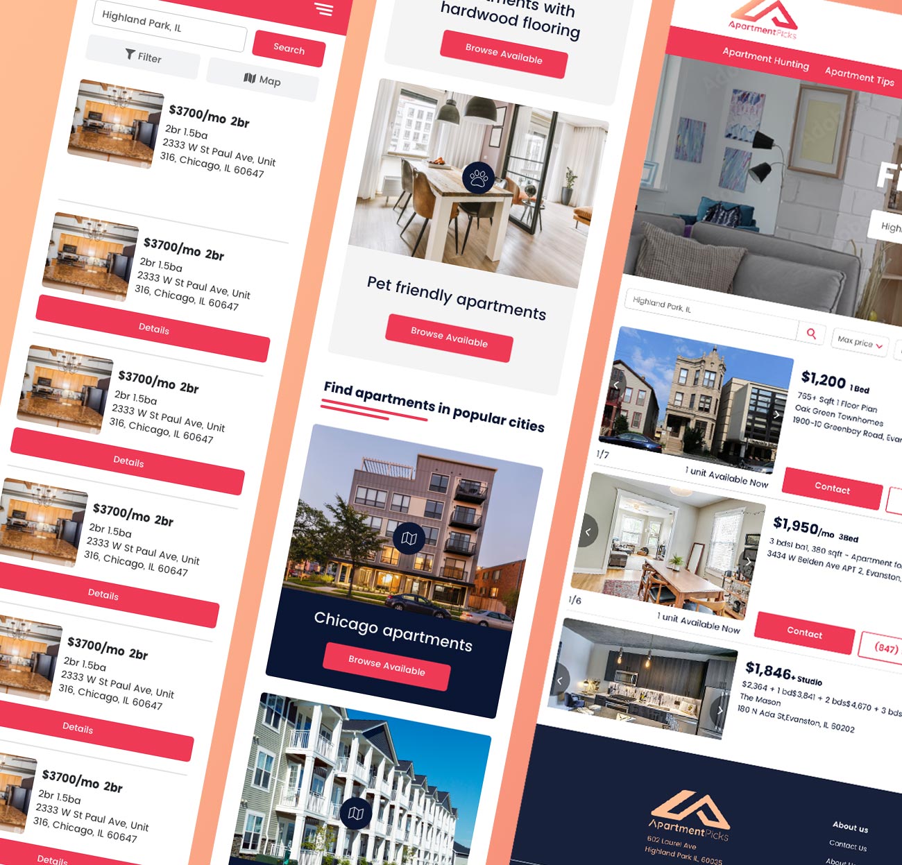
Armed with insights from our research, I initiated the development of a landing page that could display an easy to identify CTA as well as show the user that we have apartment hunting resources, such as our exclusive editorial content.
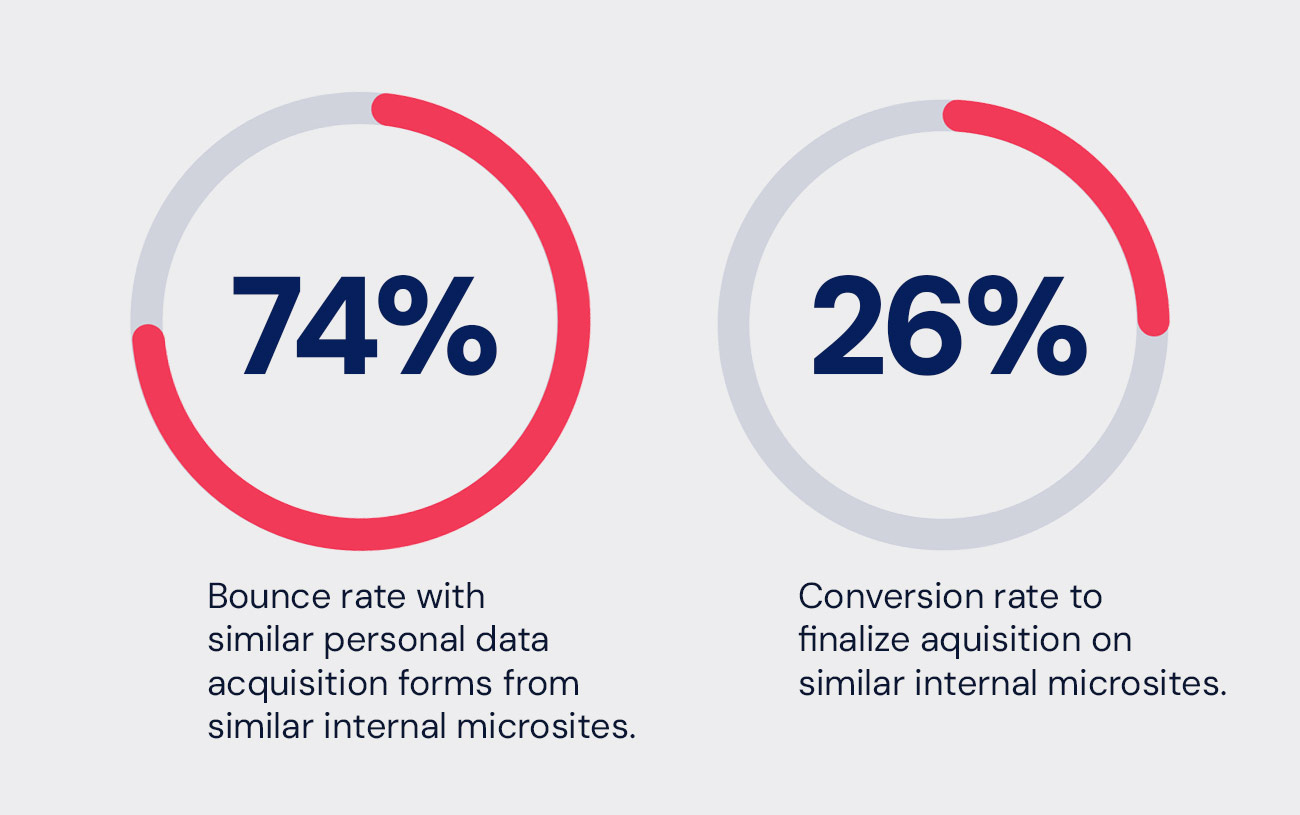
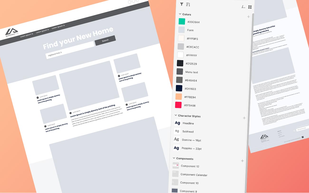
I started off with mocking up wire frame ideas in b/w. The goal was to get a sense of structure and how the newly designed logo would fit into the page. We wanted to make the CTA buttons aggressive and loud but not too obnoxious as to overwhelm the user. In previous microsites we discovered the balance is necessary in achieving our conversion rate goals.
Design & Development
I began to create a component library and color pallet that would convey the intensity we were looking for, as well as a warmness that spoke to a homely sensibility. I moved on to design detailed screen layouts with different options of apartment hunting content.
When the marketing team, project manager and I decided on a structure and page flow that would work best, I then began to focus on my communication with the developer. I provided him with development ready materials with colors, character styles, interactions and components. My knowledge of front end code practices made it easy for me to explain the goals we needed to achieve.
Conclusion
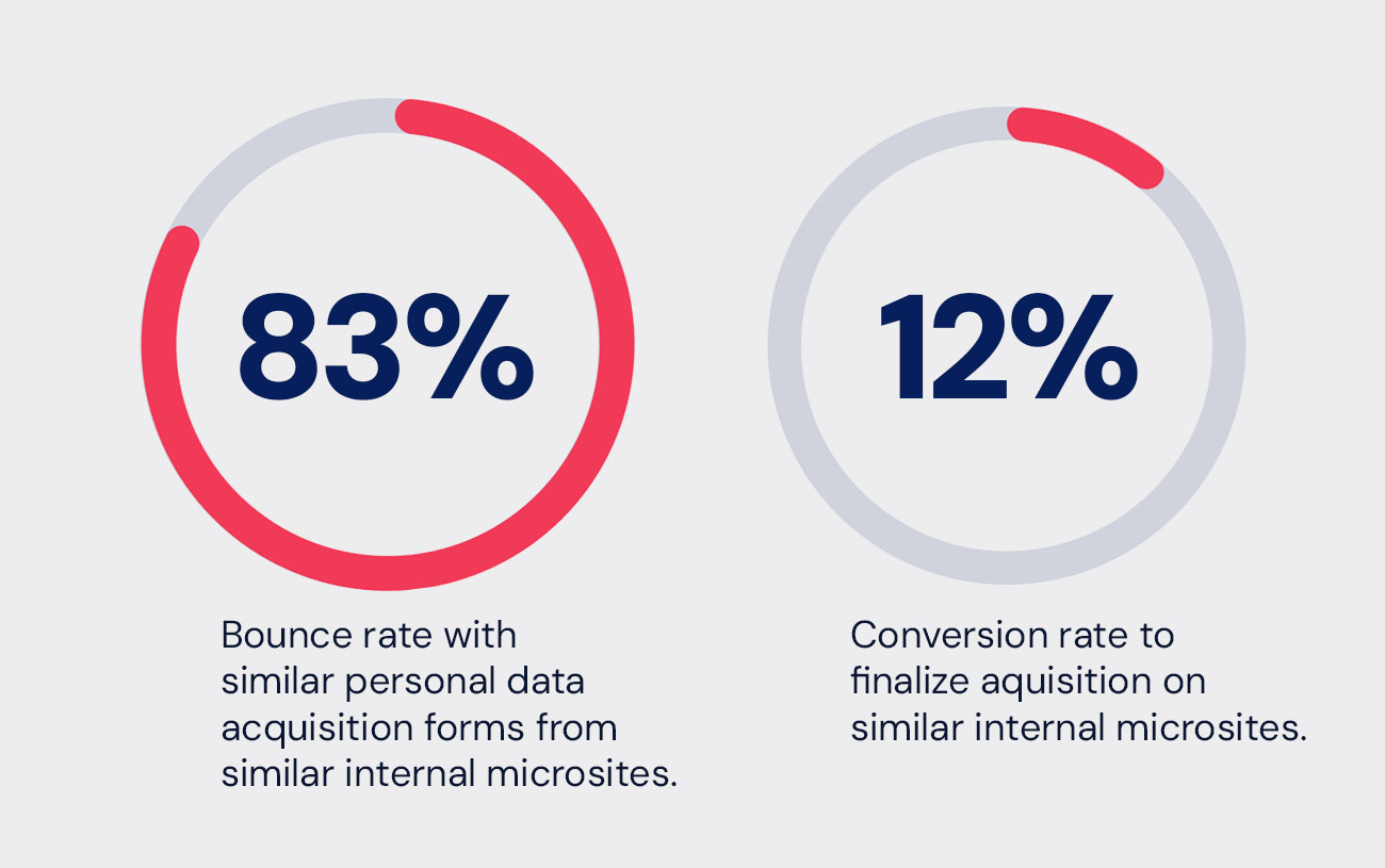
The design choices made by our team for the Apartment Picks website was a success. By achieving an over 116% increase in conversions, the parent company Web2Carz benefited.
This initiative has not only increased customer satisfaction but also driven business growth by attracting and retaining users.