Auto Finder Direct Case Study
autofinderdirect.com-
Role
UX/UI Product Designer
Creative Director -
Team
Product Manager
Marketing
Developer -
Deliverables
High Fidelity Designs
Component Libraries
The Challenge
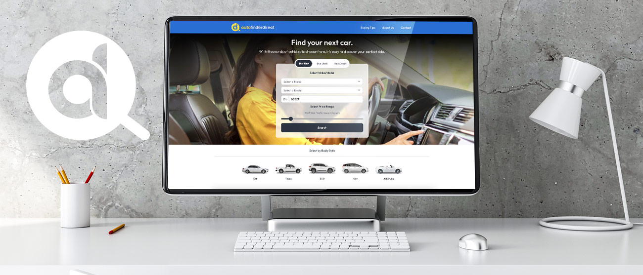
This project involved the UX/UI redesign and rebranding of the Web2Carz microsite, autofinderdirect.com. As one of five similar sites designed to capture users' personal data and direct it to the appropriate car dealership clients, the challenge was to create a user-friendly experience that would be a template for all five microsites. Despite the site's primarily mobile audience, a robust desktop version was essential to meet monetization goals.
The Plan
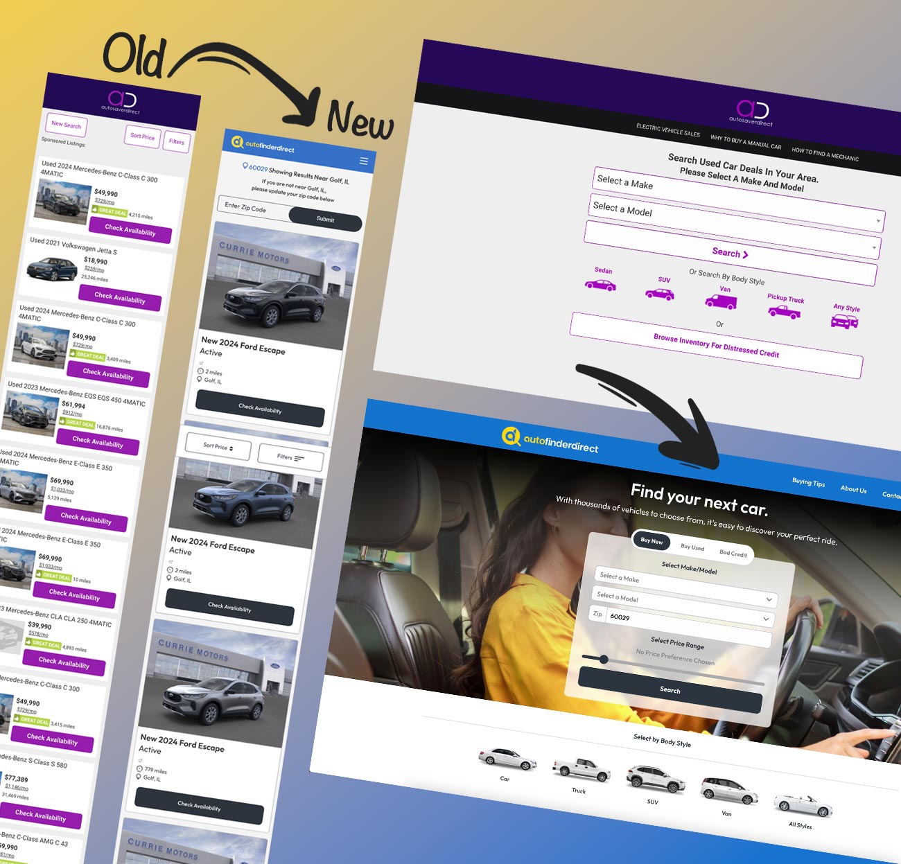
My plan was to first to rebrand the logo and website. I wanted to make a design that would be a template for our five other microsites with similar goals. After the approved rebranding and design I could then focus on collaborating with the developer to build out the website.
Highlights
Discovery
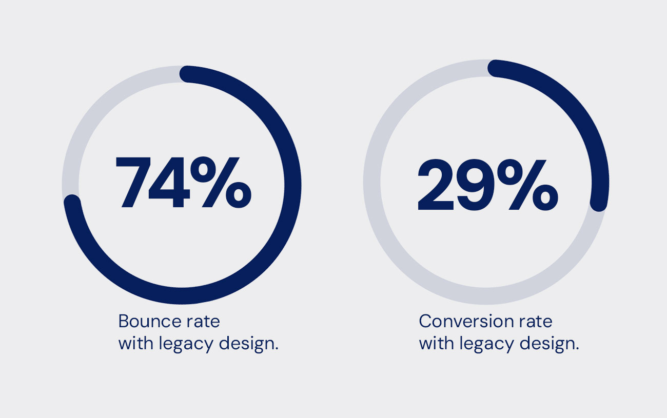
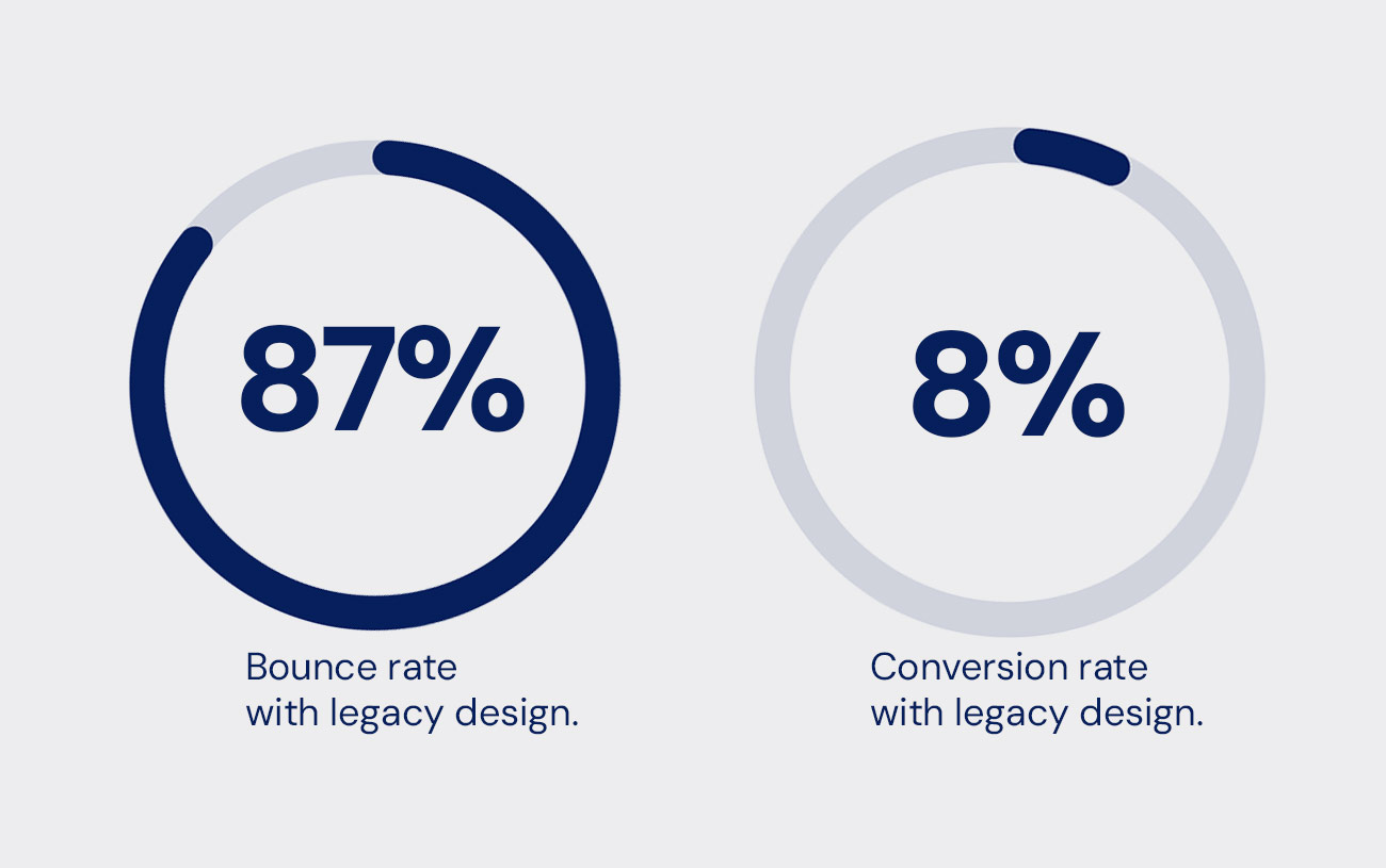
I worked with the marketing team to determine where the bounce rates were accruing. I knew I needed to design a more contemporary car listings and car detail flow. Our bounce rate of 87% needed to be lowered.
We also needed approval from Google to move forward with our PPC revenue goals. In order to receive approval we had to meet certain standards of content. It was essential that I incorporated editorial content as well as multiple search vectors into my design.
Observations
The Goal
Design & Development
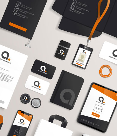
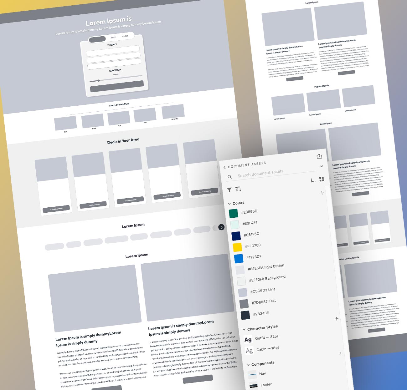
I began to develop a logo that could convey our car search services while looking current. I focused on developing a b/w wire frame that could accommodate editorial content and multiple ways to search for a car.
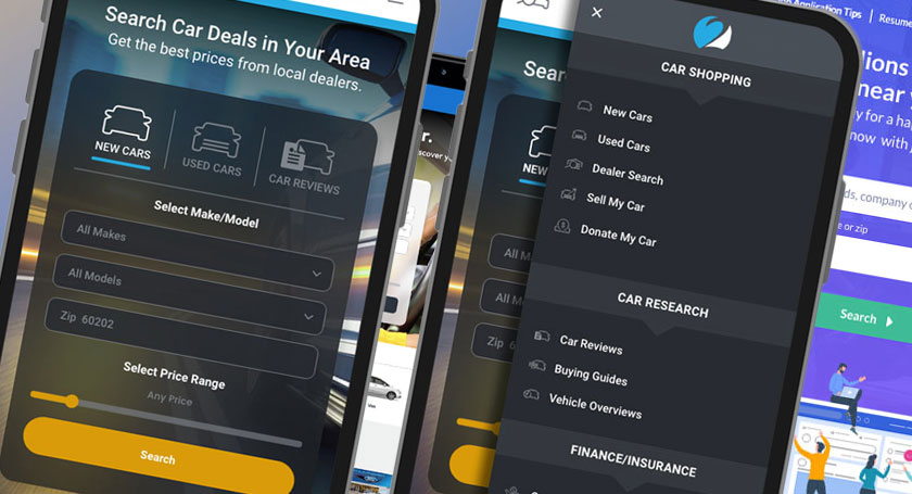
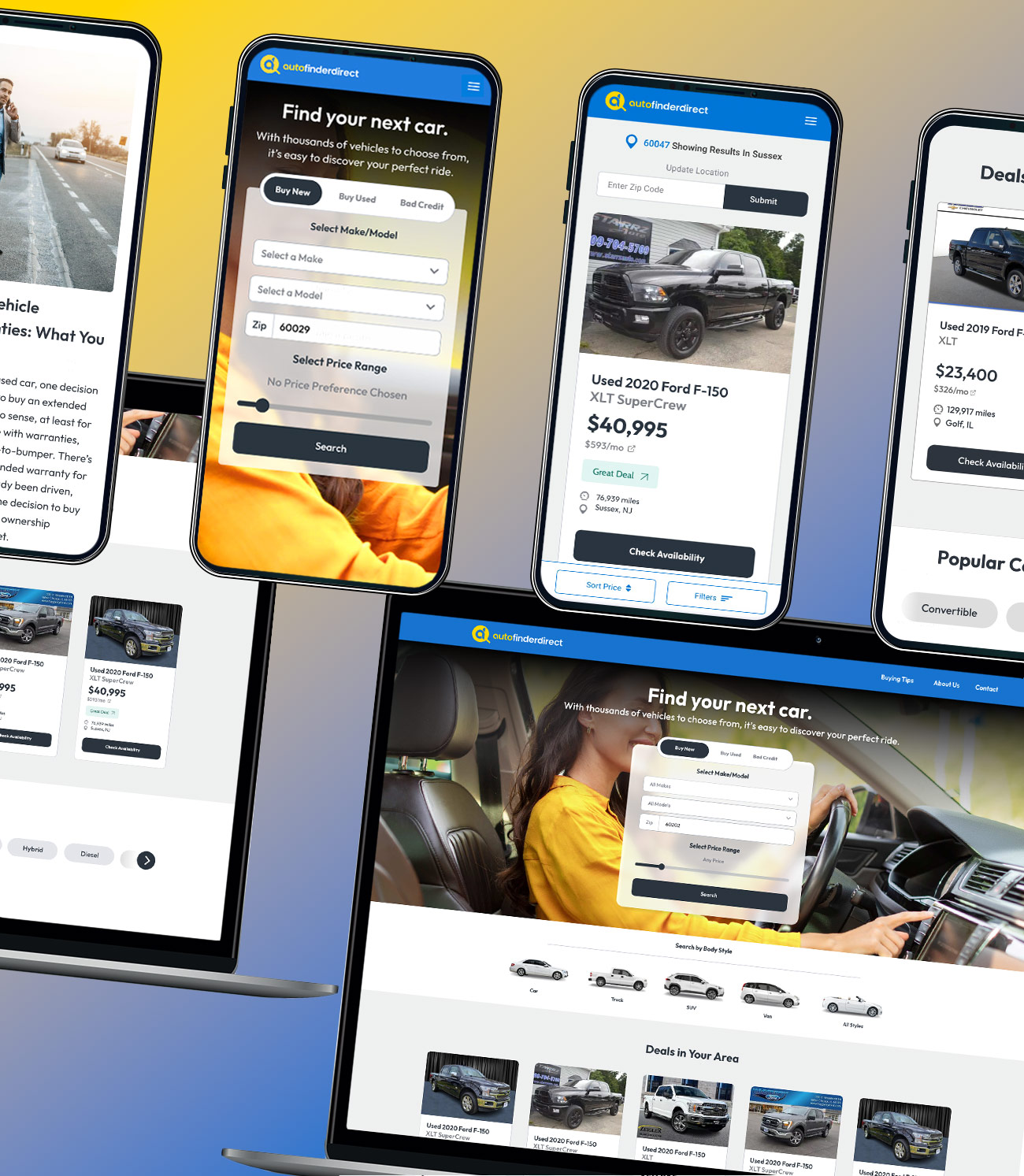
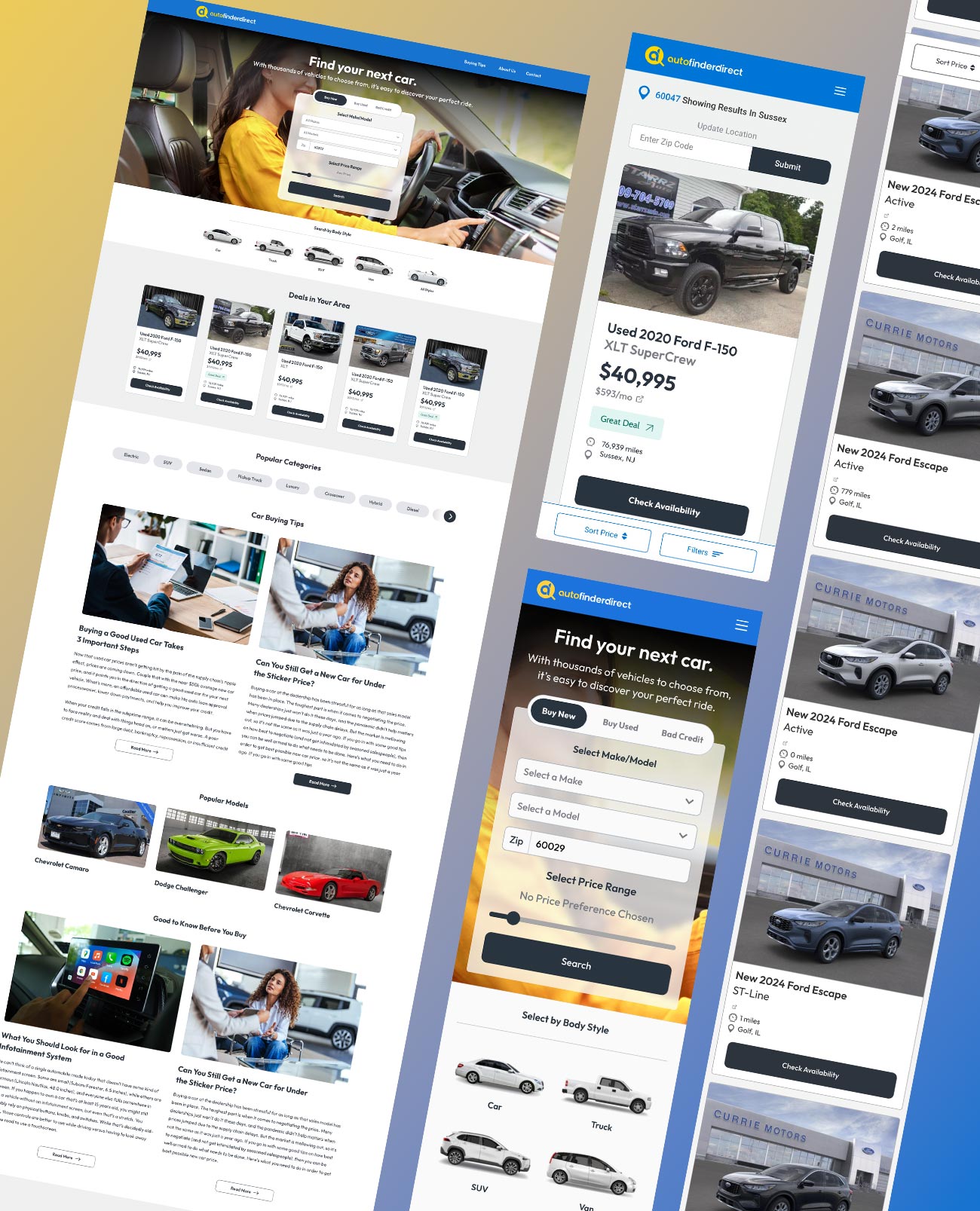
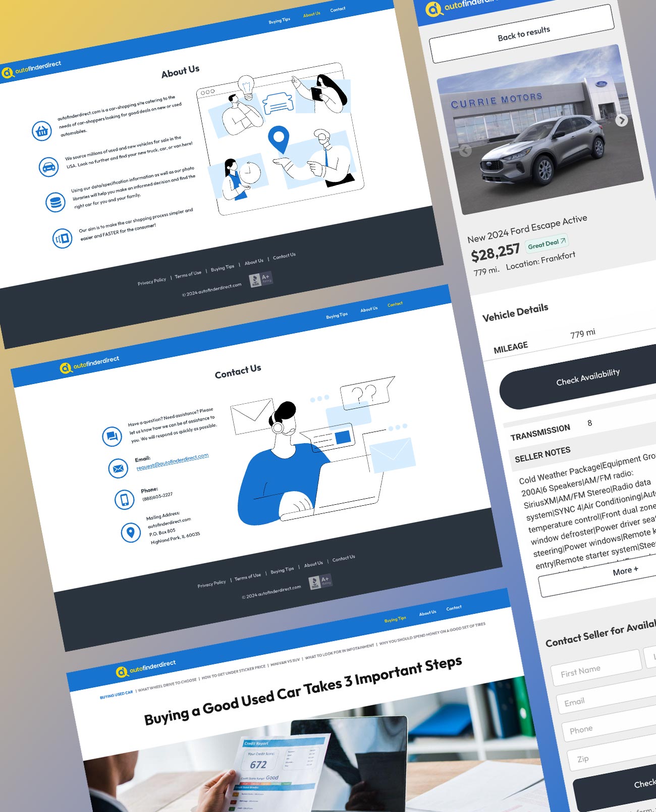
I then centered my attention on developing a main search area that could be displayed on the hero section of the website. I knew I needed to incorporate both “body style” and “make and model” search options. After the hero section was finalized I moved on to redesigning the car listing cards. I realized that creating a visual hierarchy with the car data would be crucial. I designed them to highlight the car price to make quick scanning easier for the user.
Conclusion
After development and bug fixes were addressed we began testing the results. Using our in house method we determined that with the new design we were seeing an average of 22% decrease in bounce rates. This combined with a 262% increase in conversions we knew that our work had been a success.
